College Magazine Cover 3
 Strengths
 Strengths
The strengths of this college magazine cover are:
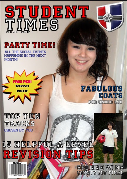
- There is a set colour scheme which is the same colours which are used in the Sponne School badge, this shows that this is the official magazine for this school
- The same font is used throughout the cover. The font used is often used for school or educational purposes, this relates to my target audience of school/college students
- It includes the school and magazine logo which shows readers what type of magazine it is and which school the magazine is a part of
- Bright coloured graphic draws attention to the incentive of a free pen voucher, the colours are used to attract the target audience to the incentive as this could be the reason that they buy the magazine as this is one of the main features
- Includes a range of buzz words including 'Fabulous' and 'Free' to help engage the readers attention. This is used to persuade potential readers to buy the magazine as the word 'Free' would catch my target audience's attention as school/college students usually don't have much money so are often looking for free/discounted products and by giving away a free pen they can use this for their school work so it relates to my target audience . Also the word 'Fabulous' would also persuade, particularly female, students to buy the magazine as by being 'Fabulous' they would be the envy of all their friends.
Weaknesses
The weaknesses of this college magazine are:
- The photo isn't as professional as it could of been which shows that not enough effort has been put into the making of the magazine which may make potential readers think that the magazine would not be as good as another magazine that they may buy
- The background of the photo is not very suitable for the setting that the model should be in, e.g. she is standing by a doorway when she could be at a desk or in front of a classroom. This is unsuitable as some students may not be able to relate to that as they do most of their work at school where this model is clearly not located in a classroom
- The font is a little too pixelated which shows that there may not have been enough effort put into the making of the magazine cover which may put the audience off buying this magazine as they may think that if the front cover doesn't look very professional then neither will the rest of the magazine
- The school equipment cannot be seen very well in the shot, this means that the picture may not look like it is necessarily for a college magazine, which means that the target audience may not be able to relate to the model therefore they may choose to buy a different magazine which they think will be more suitable
- The second photo is not edited very well onto the magazine cover. This makes the magazine look unprofessional which may make a potential reader not buy the magazine as when i conducted my questionnaire for what students would like in a school/college magazine, a majority of them said that they would not buy a magazine if the front cover wasn't very appealing.